The Fistface Children's Book
Copies of “The Legend of Fistface” children's book.
When you have kids you think about things differently.
One of those things that came to my mind after having a child was the idea to make a children’s book for her (and subsequently gifting that book to some close friends involved with my inevitable muse for the book).
I decided that a lot of my ideas these past few years come back to my film, Fistface, and how I can keep using all the ideas I poured into that film for other projects. So naturally my idea for a children’s book would revolve around my film.
The challenge with any film, photo or book is telling a proper story.
My film Fistface has a “story,” but it’s kind of all over the place. So in order for me to turn it into a book I had to pick and choose what elements to include, make sure those elements make sense and make sure the story isn’t too over the top (like the film was…).
Eventually I threw the idea of an age range for my book out the window, because there was so much content I wanted to include I decided to sacrifice keeping the story simple, for the most part. The final book ended up being around 20 pages. Not too over-the-top, but not simple enough for a small child. Nonetheless, I will read this story to my infant daughter and it’ll be something she can read at any age really (with a little help).
After I had the story locked down (with some proofreading and content clarifying from my lovely wife) I set about creating the images for each page.
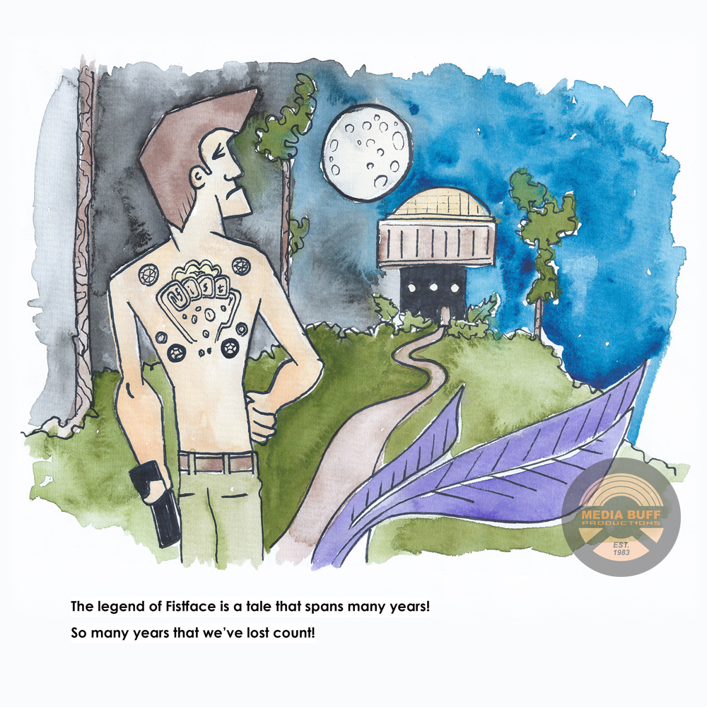
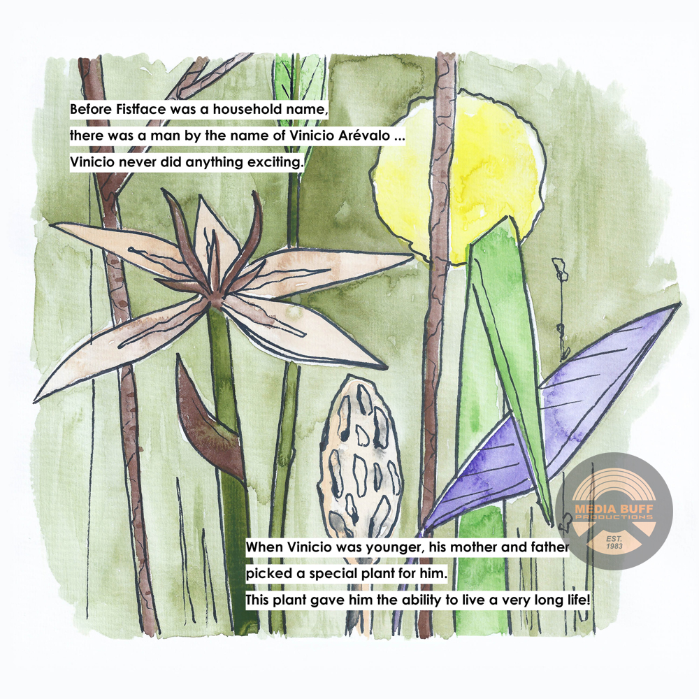
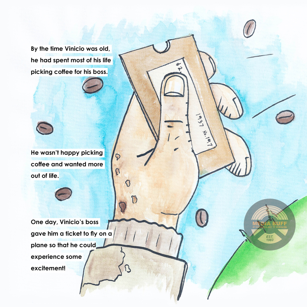
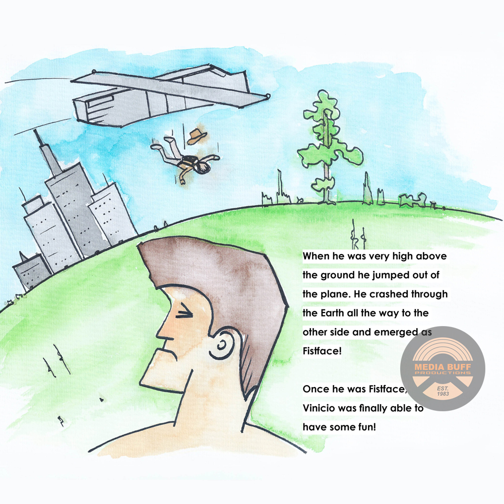
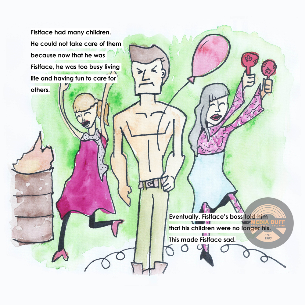
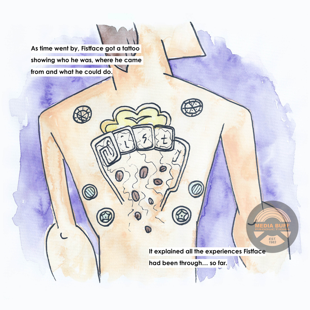
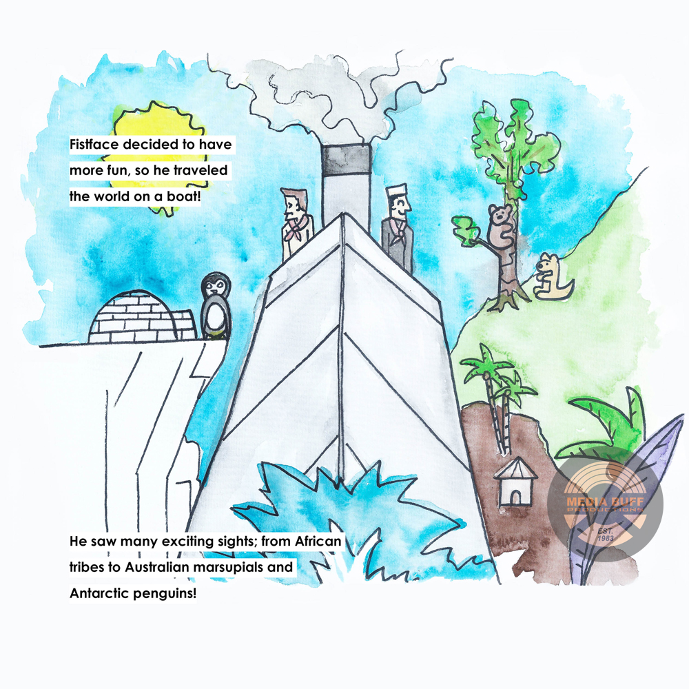
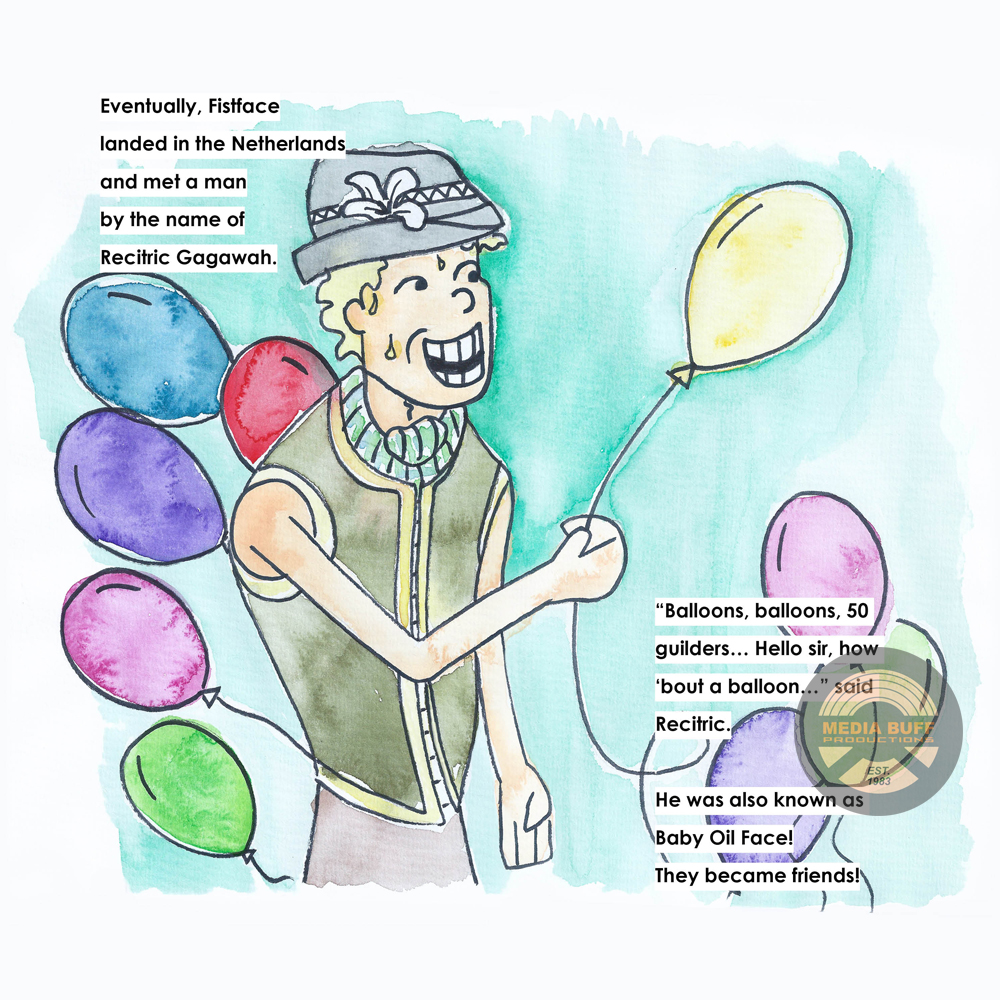
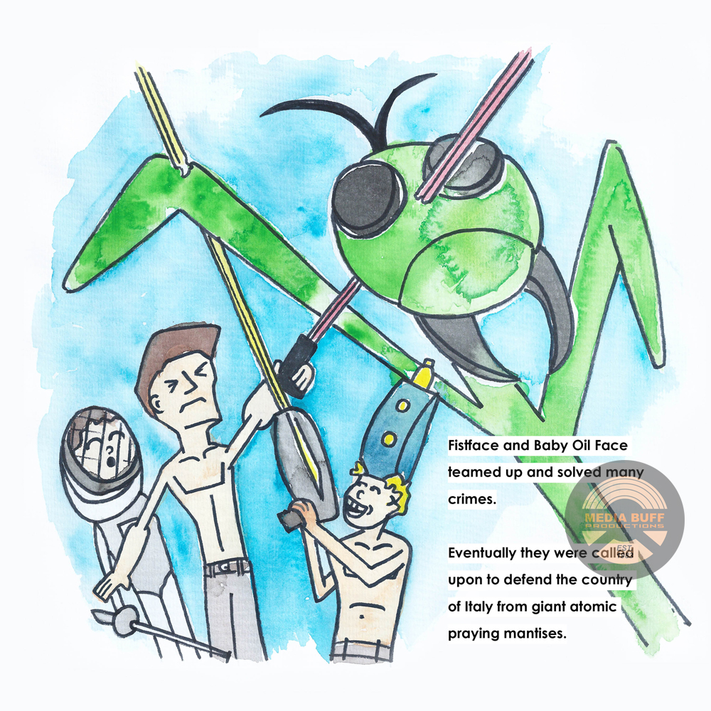
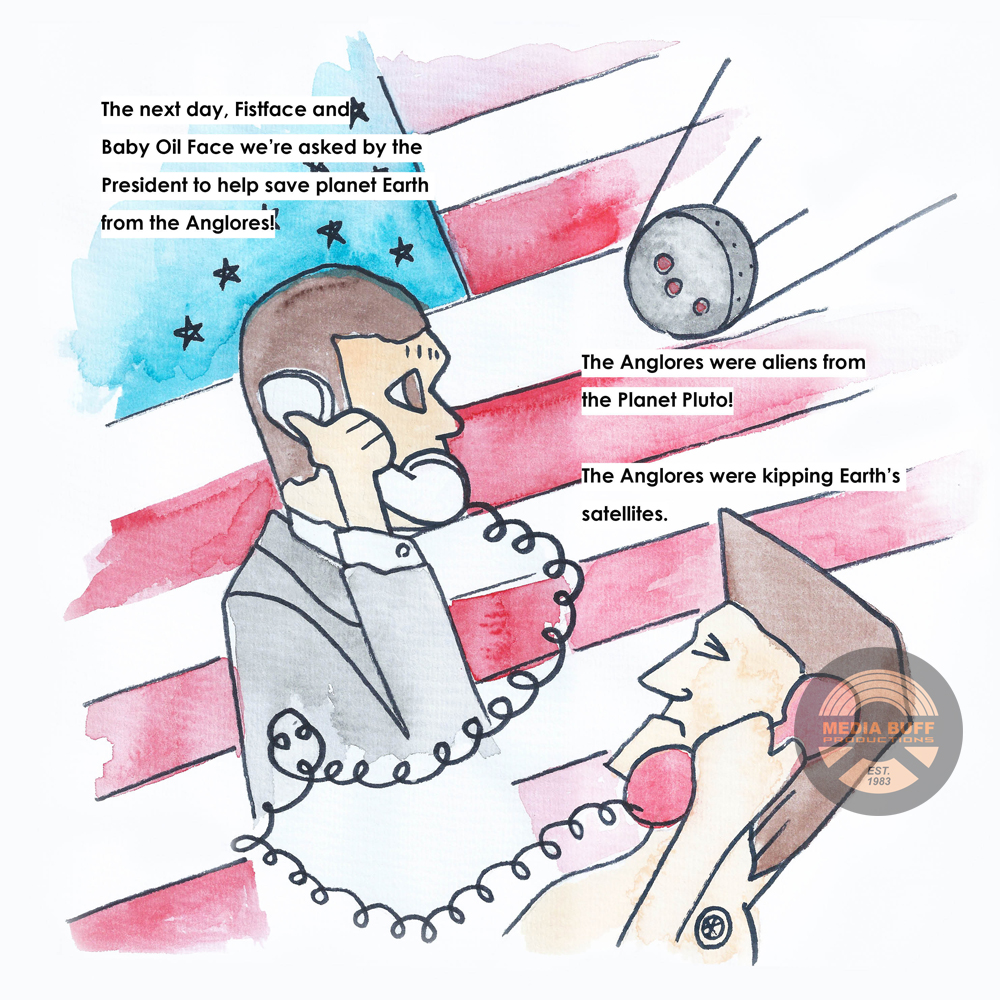
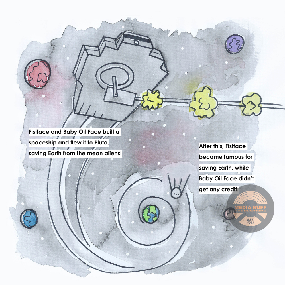
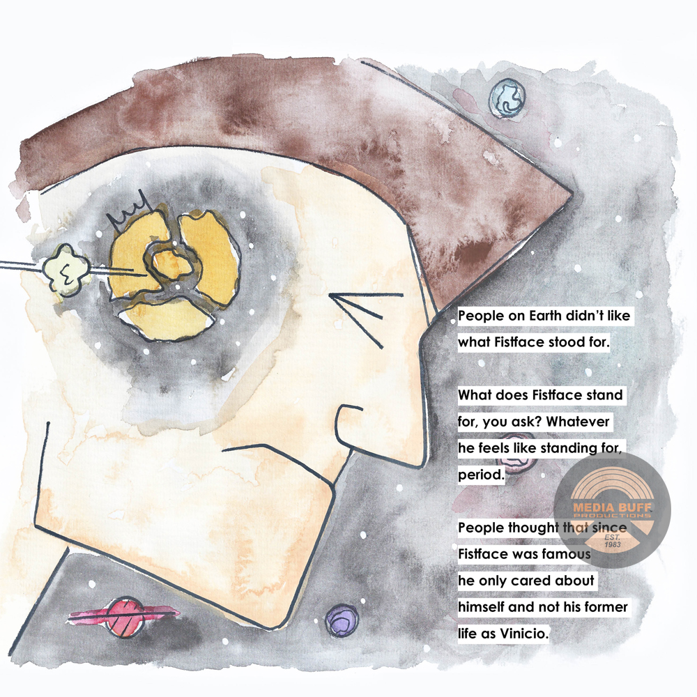
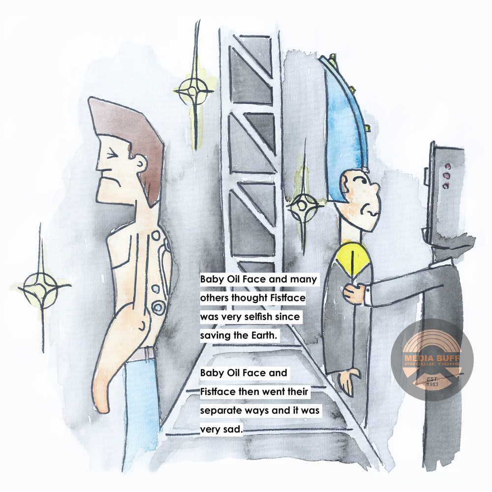
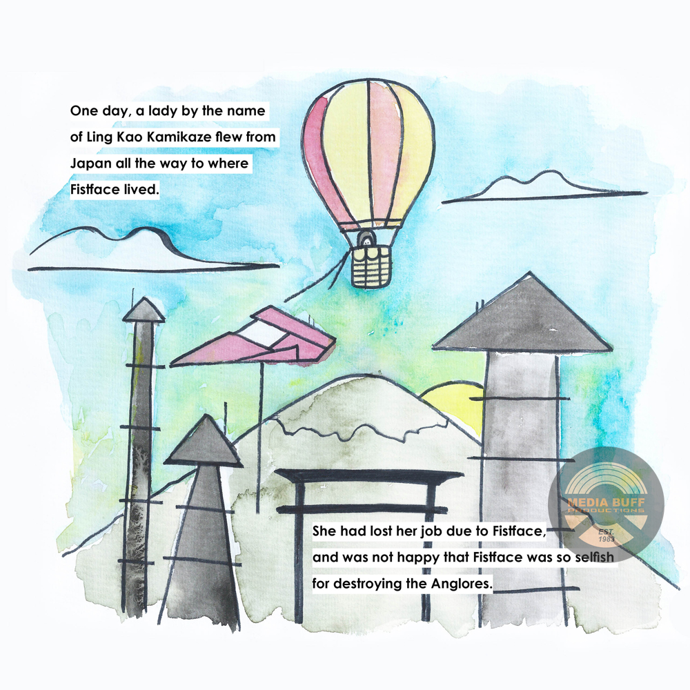
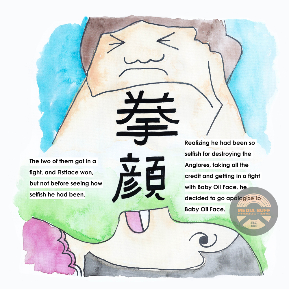
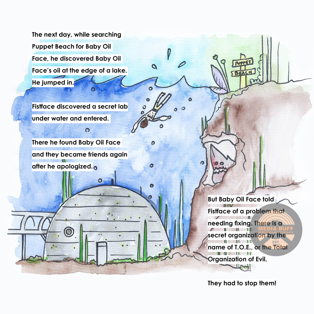
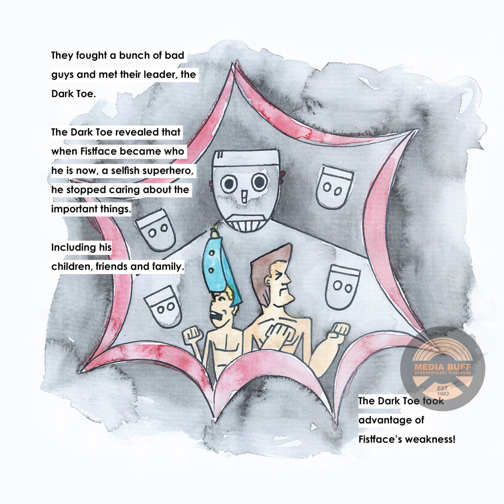
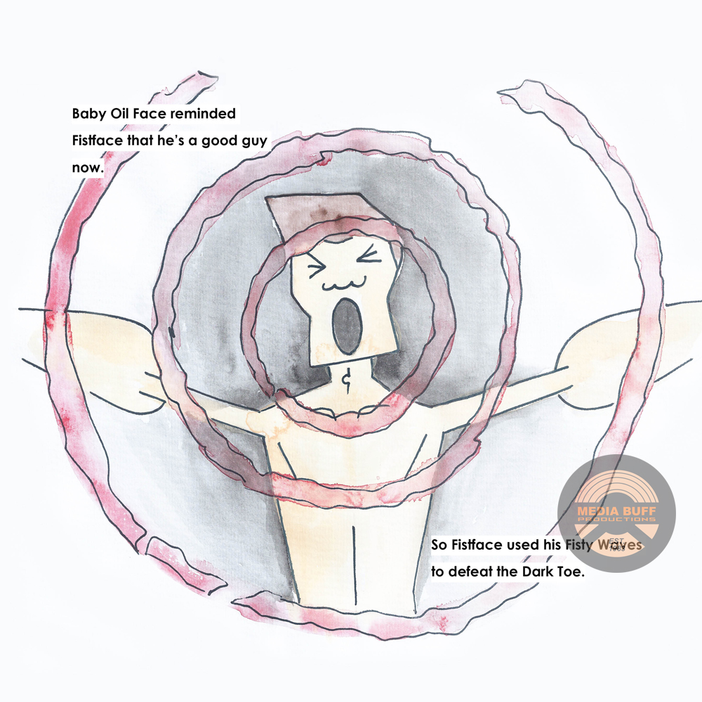
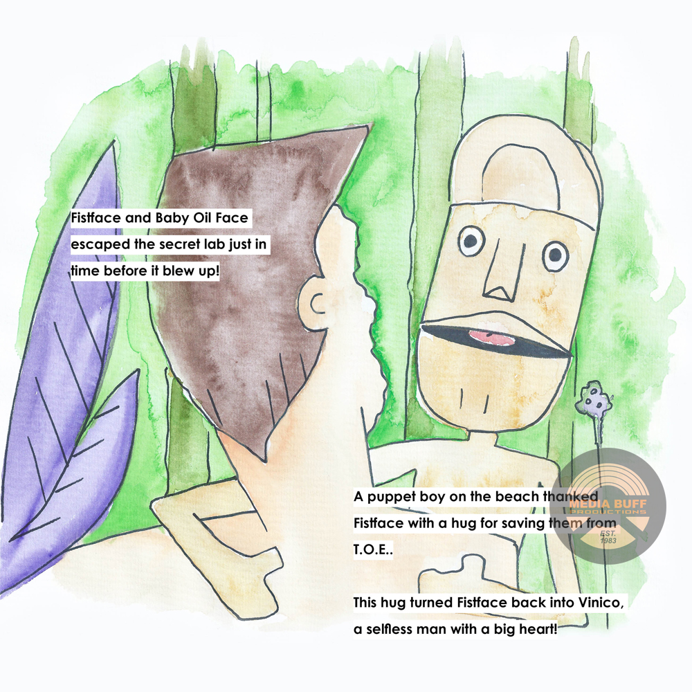
Some of the pages have a fair amount of story, so I had to focus in on one element of that page’s content to visualize.
For the look of my book I poured through some of my own favorite childhood books, looking for common elements to make sure to include, as well as styles. Disney is a hugely successful style, with characters that have large eyes and wonderful body flows. I didn't want to get bogged down with making my characters have the perfect “family” design, where all the characters have elements that you can see are from the same family - like hand design, eyes, animals, etc. But, through illustrating it myself the characters were going to have their own style, and I was fine with that. It helped me tackle the project quicker.
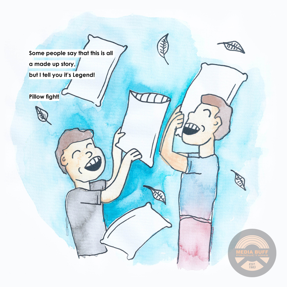
Once I had my design in mind I sketched each page out. Going back to some of my favorite children’s books, I decided not to do the more modern digitized look for book characters. I opted for a more portrait, hand-drawn feel. And so I went with watercolor for the color palette and look. I have only dabbled in watercolors, and that was years ago. So I got myself some watercolor paper (which handled the colors perfectly) and a bevy of colors. I also borrowed some watercolor brushes from my artistic, pastel portrait creating, father. I then colored in all the sketches, using my sketch as the boundaries for every color. I took special attention in making sure the elements that make watercolor so beautiful show through, which is the spilled water look, and layered shades of color. Once I had all the pages dry, I went back and outlined everything with a thin, black marker. I could have left the colors as is, but I wanted them to pop even more.
After all the pages were drawn and colored, I scanned them into the computer and cleaned them up, laying them out with the words of the book. I didn’t really leave room for the words, as I wanted the image to tell the story, so in order to eliminate as much clutter as I could, I put boxes around all my words. This made the story pop from the pages better.
From there, I opted to use Shutterfly to lay out my book and have it printed. I’ve used them for photo albums before, and hand drawn images, plus they are easy to use and you can do whatever quantity production you want.
Once I received the book in the mail I was very pleased with the result (example pictured above). I’m exited for the day our daughter comes to realize the book she’s known all her life was created by her dad. I also dedicated the book to our daughter, wishing her all the joy and creativity life has to offer.
View the full book below. Interested in your own copy? Contact us!
- The Media Buff
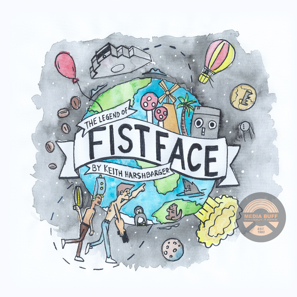
p.s. One of my favorite pages from the book is the cover. I love representing an entire body of work with a collage of images from it. And I think it turned out pretty well!
